UNDERSTANDING THE PROBLEM
What is SupplyPro?
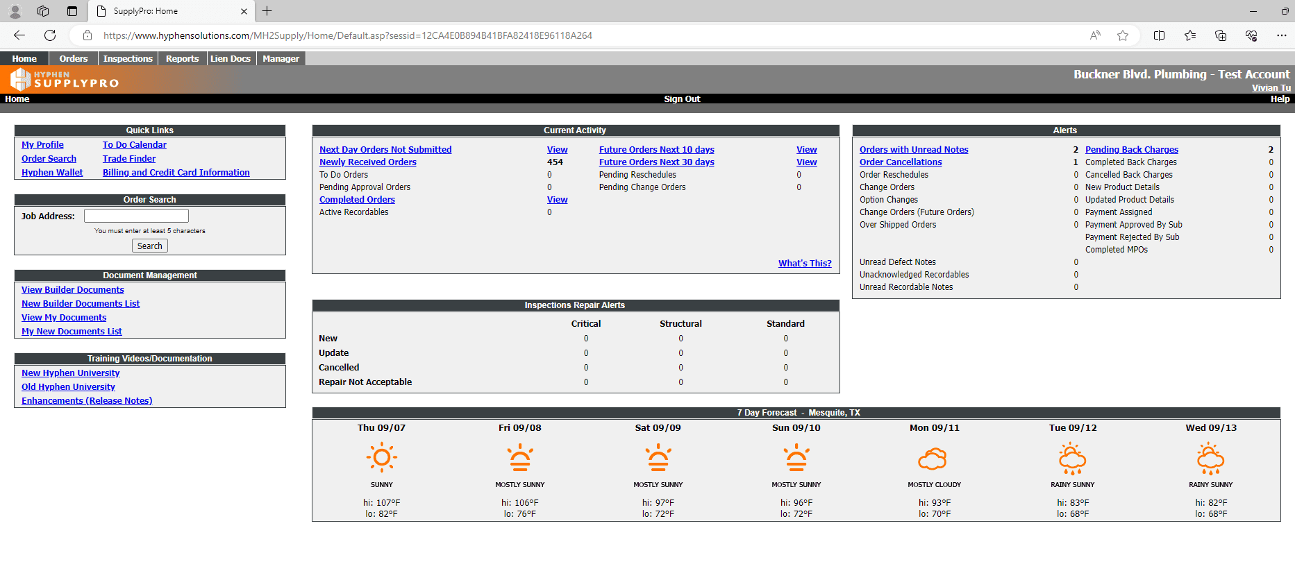
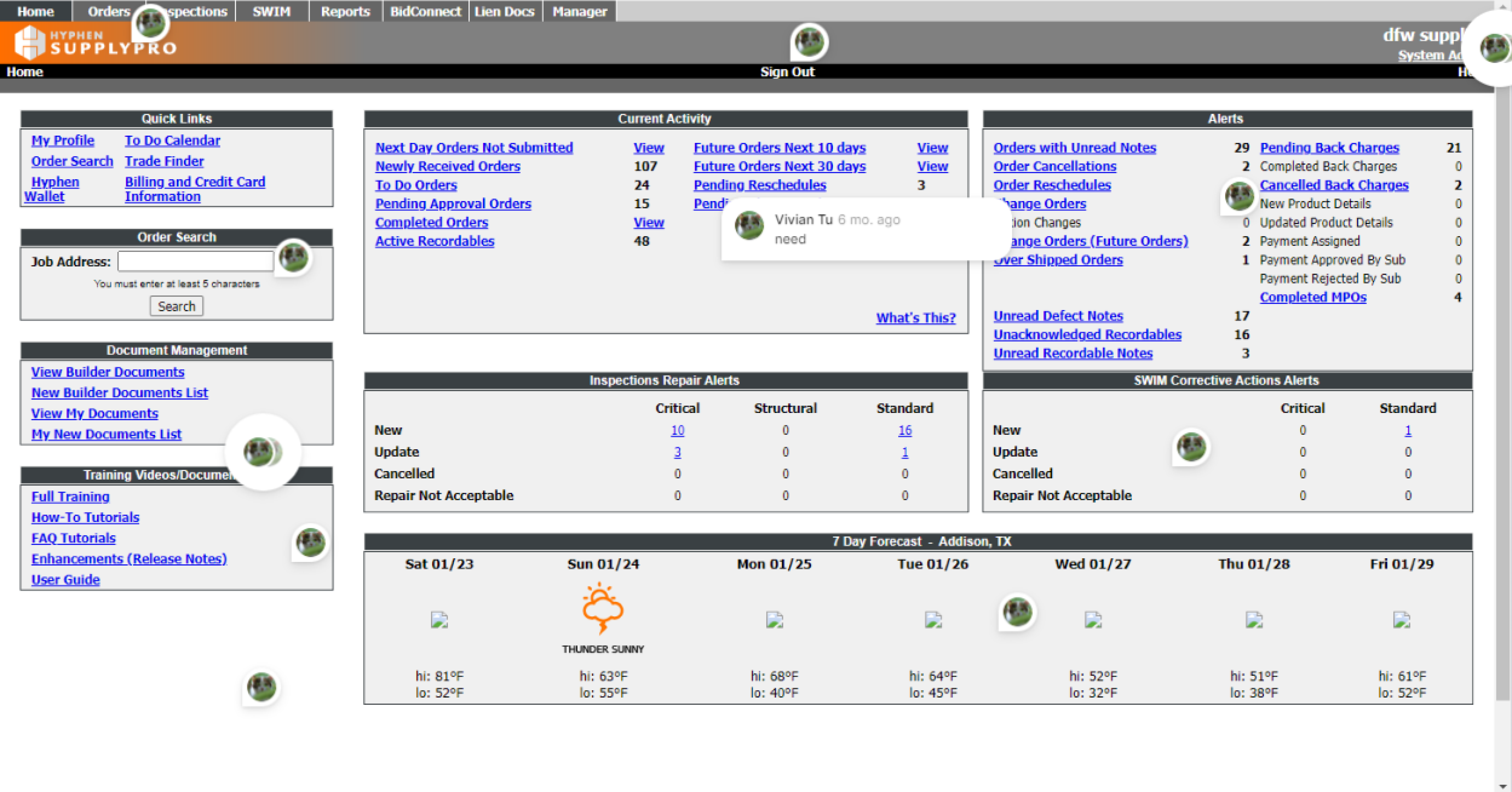
Before starting the redesign, I wanted to understand the current SupplyPro website application. With this application being 20+ years old, there were a lot of features and business rules I had to understand before even touching the design. My manager gave me a login and I took a day to play around with the application to really get a feel of how the current SupplyPro worked. In short, SupplyPro is one of Hyphen Solution’s web applications that suppliers use to communicate with builders about tasks, jobs, and more.
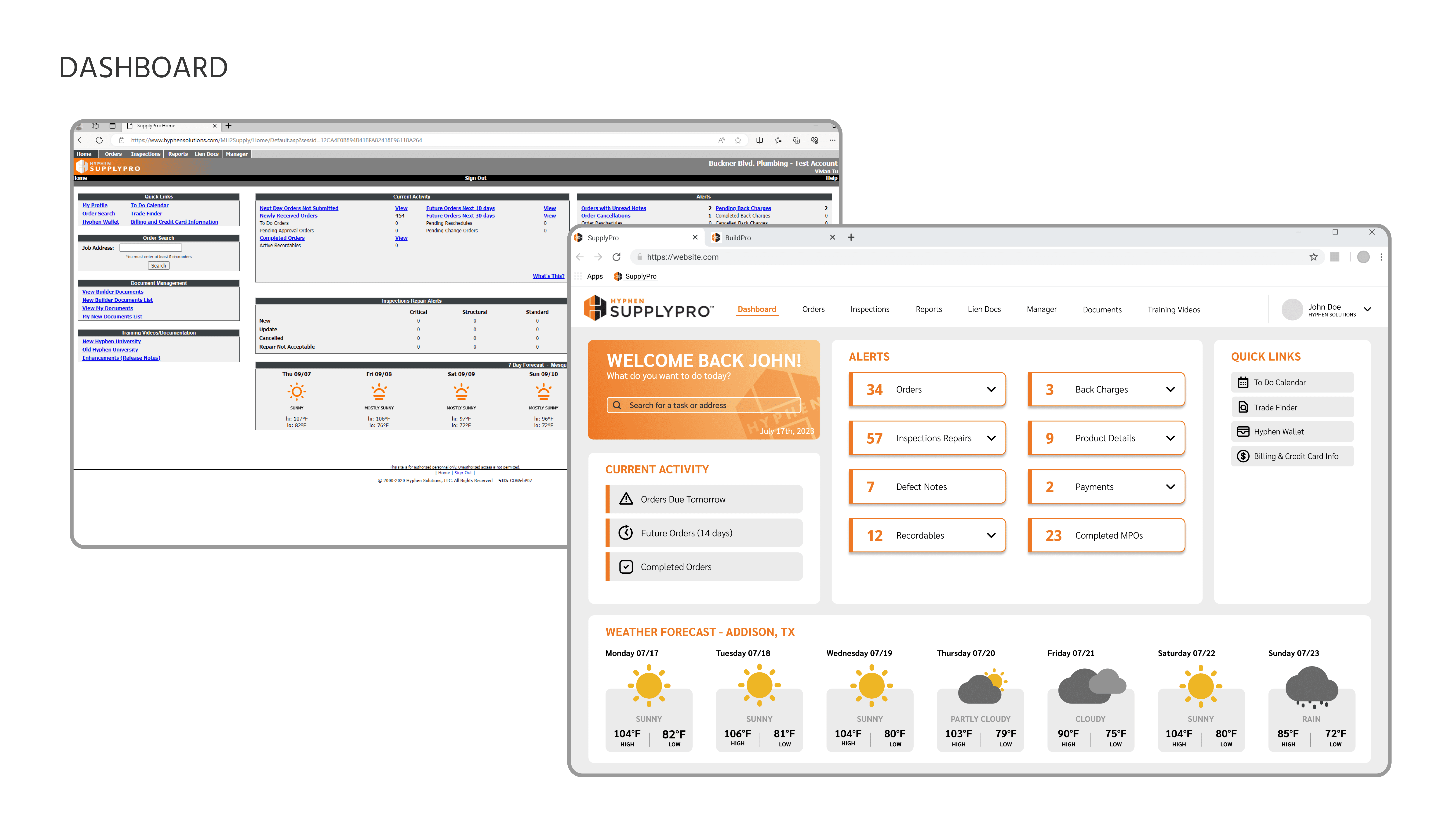
Screenshot from the current SupplyPro dashboard.
USER RESEARCH
Understanding SupplyPro better.
Since I was fairly new to the SupplyPro application and construction management scene, I wanted to ask more questions regarding SupplyPro. I reached out to my manager to conduct a user interview.
INTERVIEW
It's important to always keep your users in mind and to find ways to reorganize content instead of deleting.
Goals for the redesign.
After conducting user research, I had a couple of design goals in mind:
Make the application seem less overwhelming. On the dashboard alone I counted 57 different links. I wanted to reorganize the content in a way that was easy to digest especially since a lot of the web application was text-heavy.
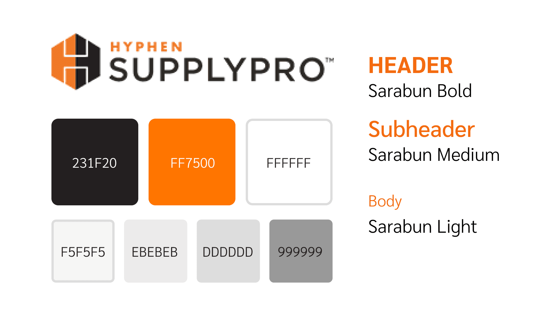
Maintain Hyphen Solution’s brand identity. My manager joked with me how Hyphen Solutions had “Halloween colors” (orange and black) and it may be hard to work with. I wanted to keep Hyphen’s colors while making sure it did not seem like a Halloween design.
Design something intuitive. As a new user, I found the original application hard to navigate and sometimes had to ask my manager how to get to certain features. I wanted to take common UX practices and apply them to SupplyPro such as the usage of icons, text hierarchy, and color to emphasize certain features (CTA, priority, alerts, etc.). This way it’s easier for users to navigate through the web app and increase efficiency.
IDEATION
Taking inspiration from existing products.
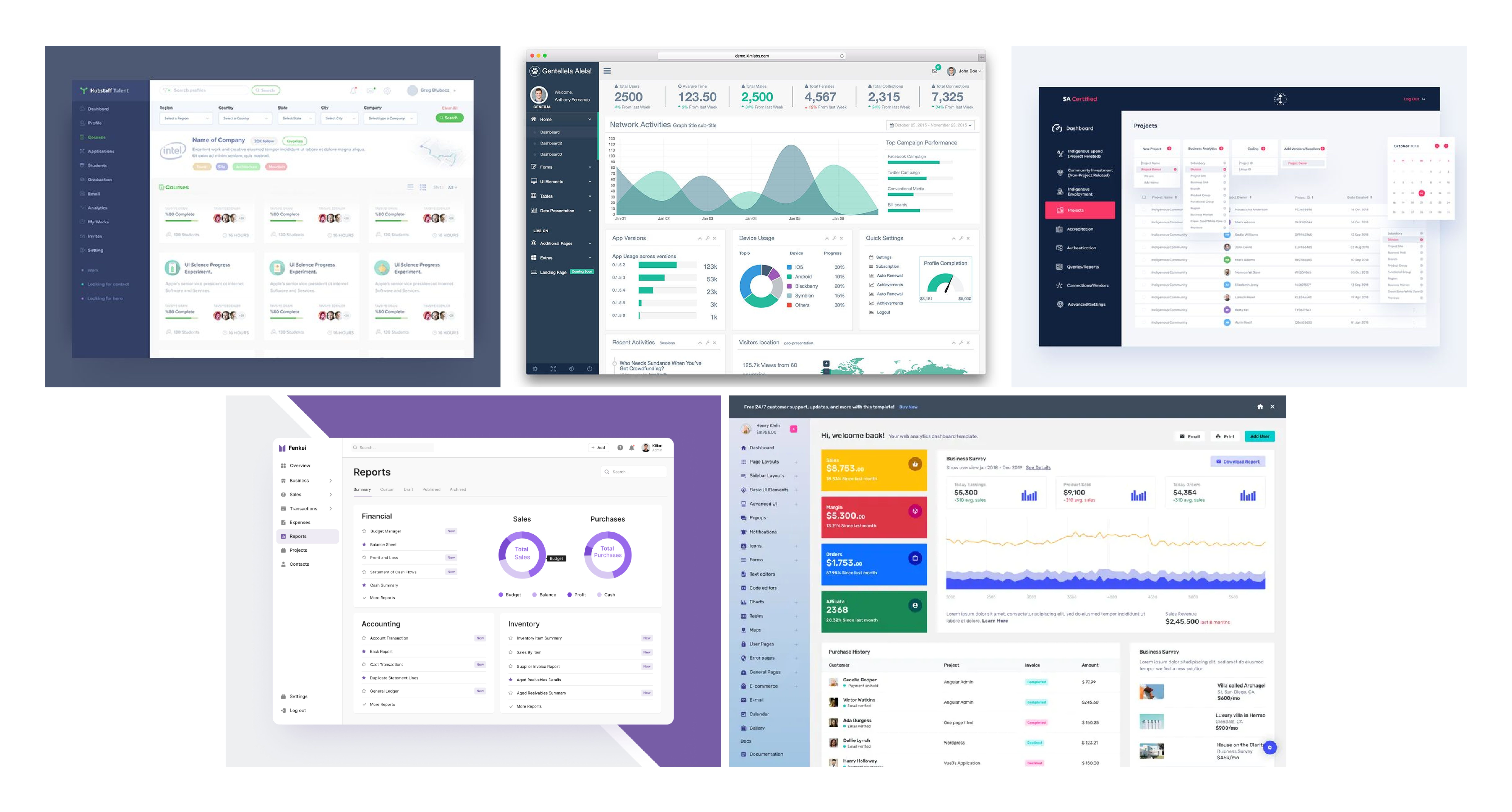
I did some research on existing dashboards and made notes of aspects I liked (spacing, aesthetic, use of colors) and disliked. Then I created a collage of dashboards I wanted to take inspiration from. Then using insight from my interview, the current SupplyPro app, and existing designs, I started designing.
STYLE GUIDE
Keeping the same Hyphen Solutions feel with a modern twist.
LOWFI WIREFRAMING
I mapped out all the content so I could focus on designing in sections.
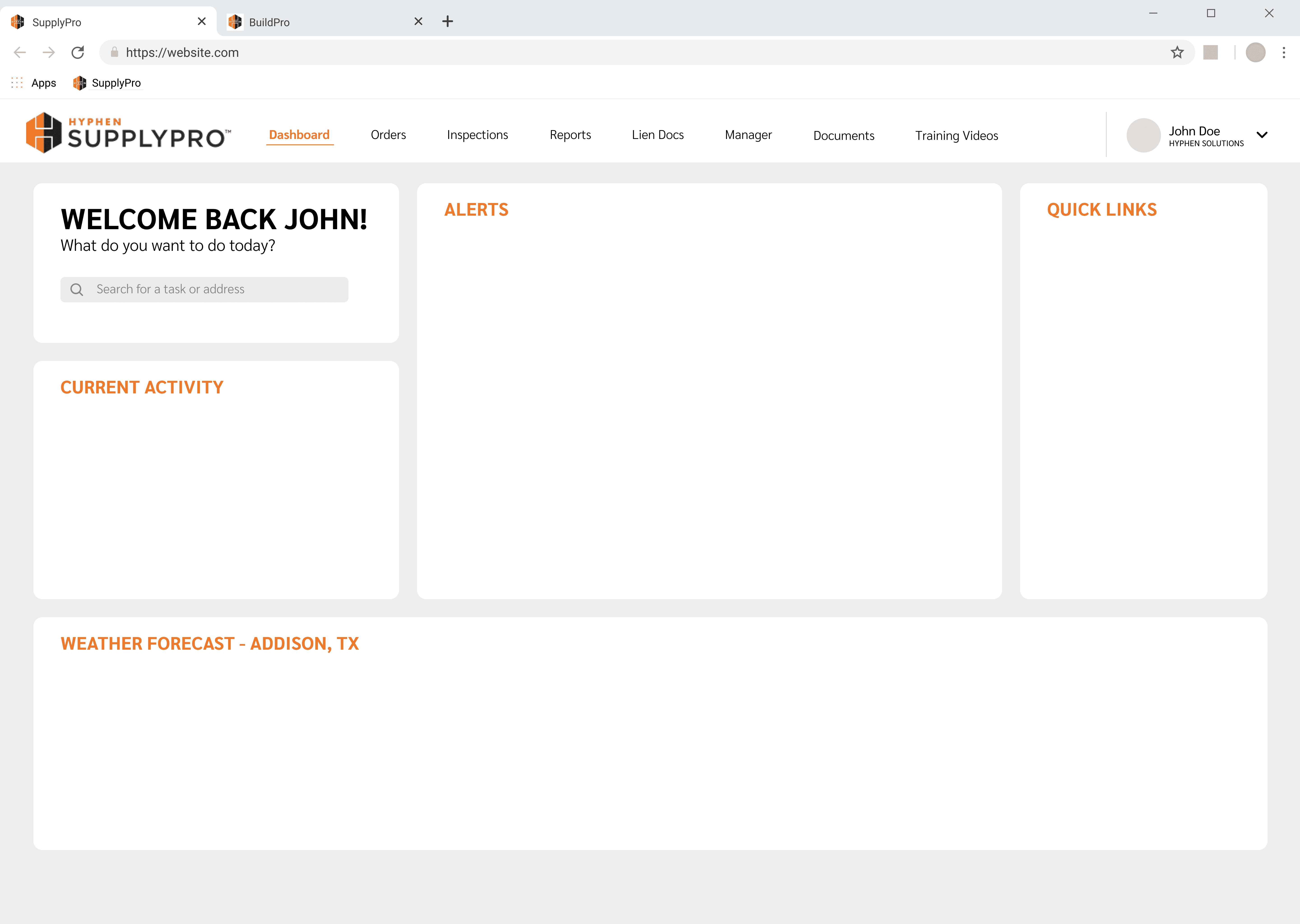
After deciding on a design system and color scheme, I started by dividing up all the sections of the dashboard and mapping out content. Then I started to design by section, planning and reorganizing content.
REORGANIZING CONTENT
I took a moment to reorganize all the alerts in a more intuitive way.
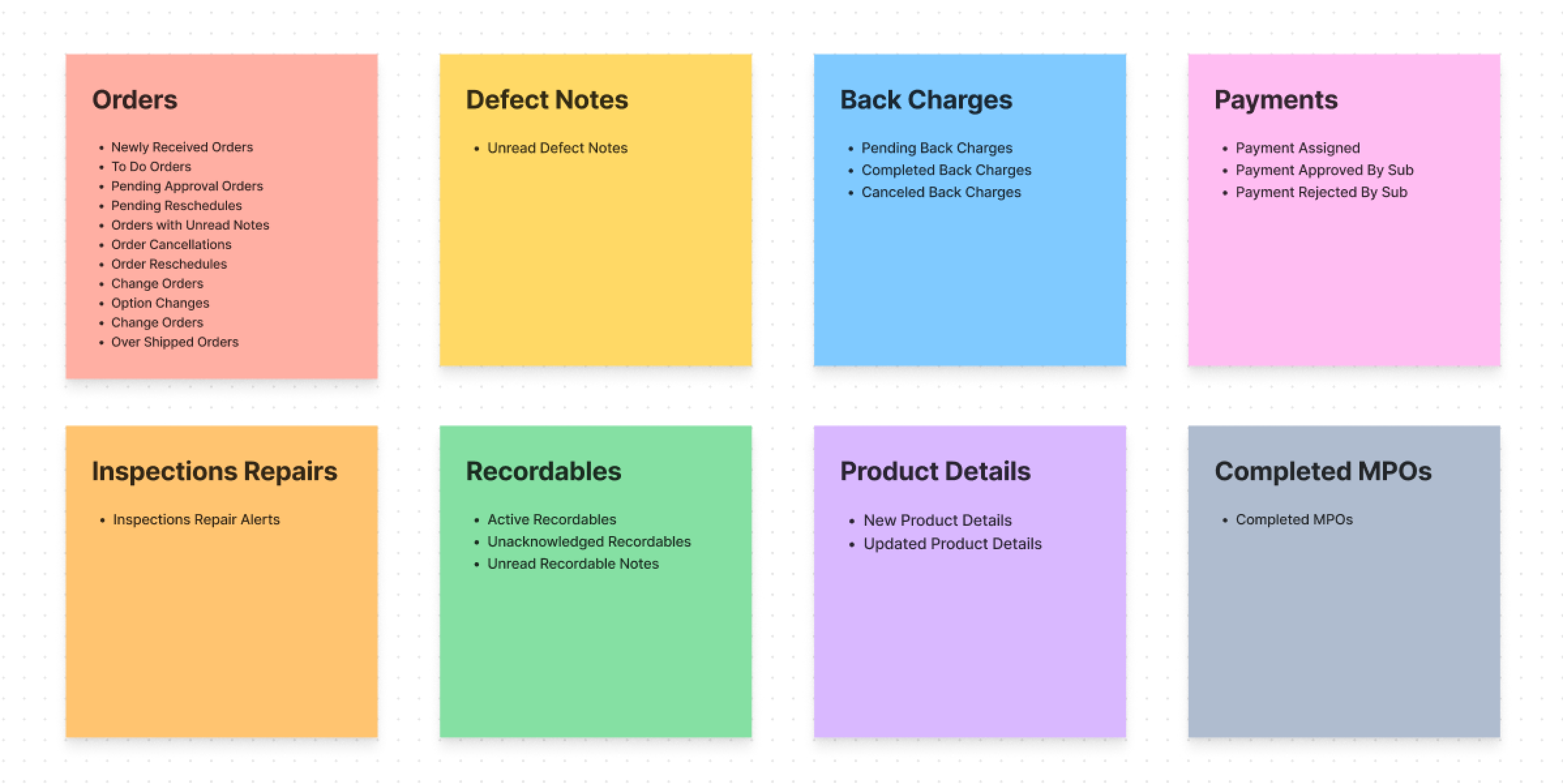
Looking at the home screen of SupplyPro, there were 57 links users could click on, 25 of them being different alerts. Thinking back to the interview with my manager, I knew I had to find a way to reorganize content instead of deleting. To make the application seem less overwhelming, I made 8 main categories for all the alerts and sorted all of them. This way users can easily click on the categories and find the alert they're looking for.
FigJam sticky notes of the sorted links in prospective catagories.
ITERATIONS
Changes I made along the way.
As I designed, I kept in mind what my manager said during our interview as well as other design practices.
1.
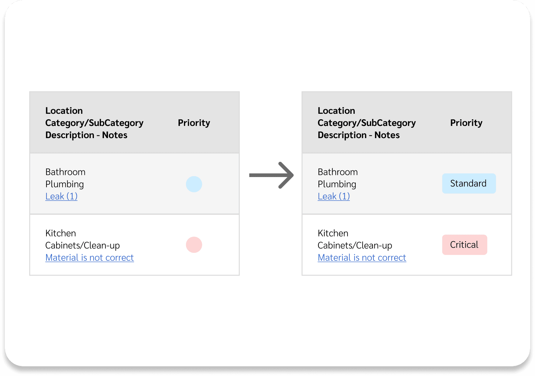
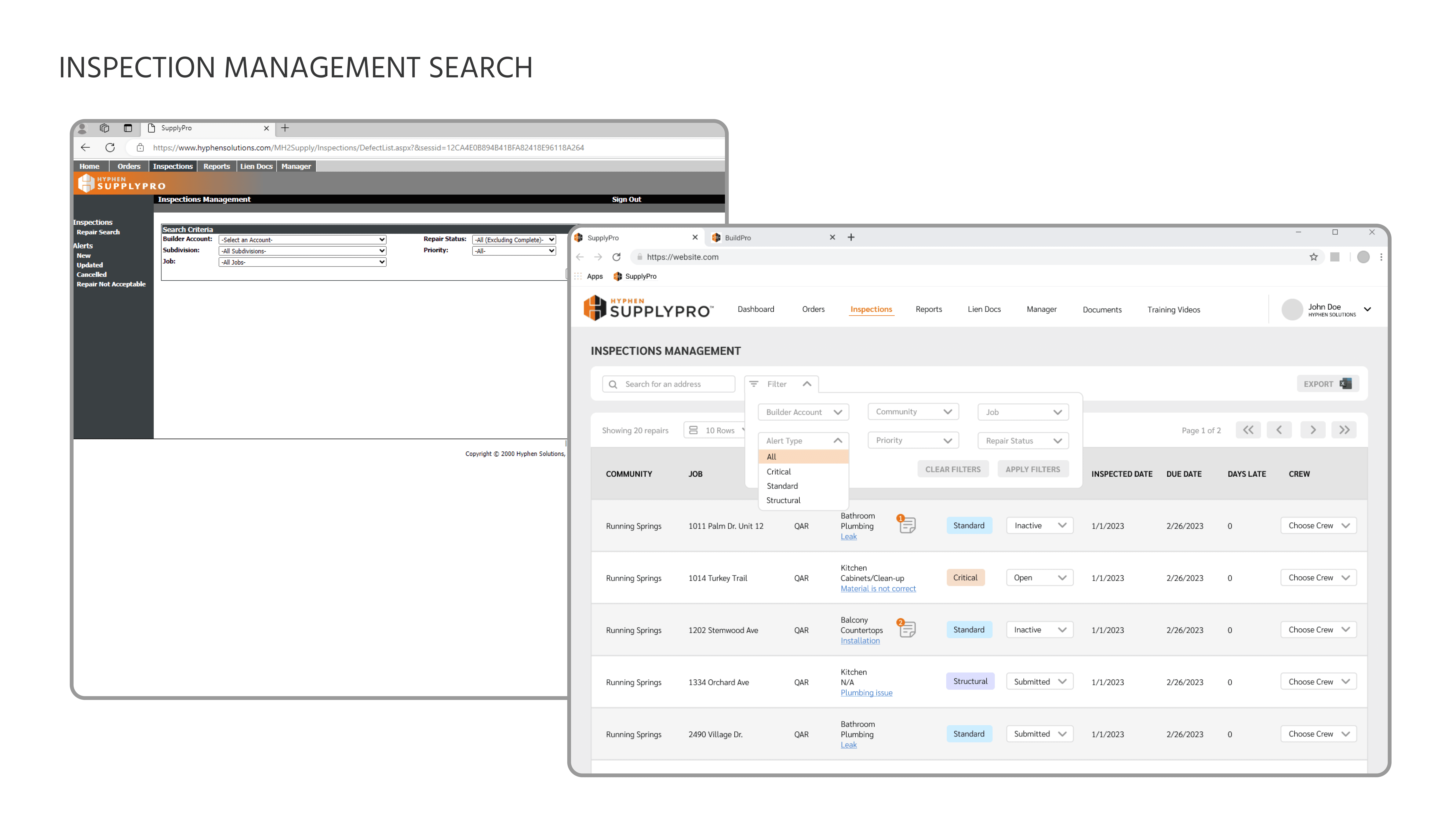
Considering a wide range of users. Since a majority of SupplyPro users are male, there is a higher probability for users to be colorblind. By using the combination of color AND words, it ensures that all users can use the application. Color alone should not be used to signify priority.
2.
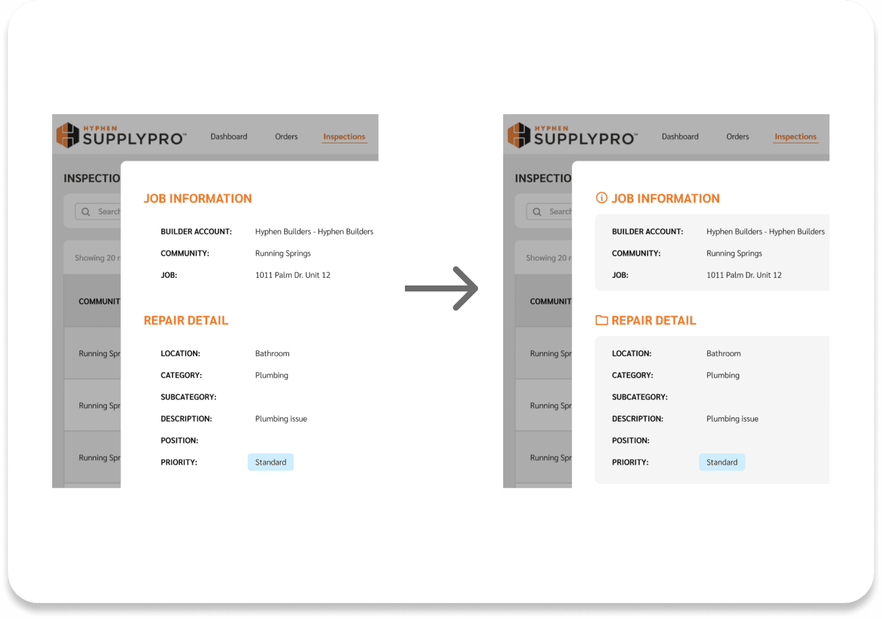
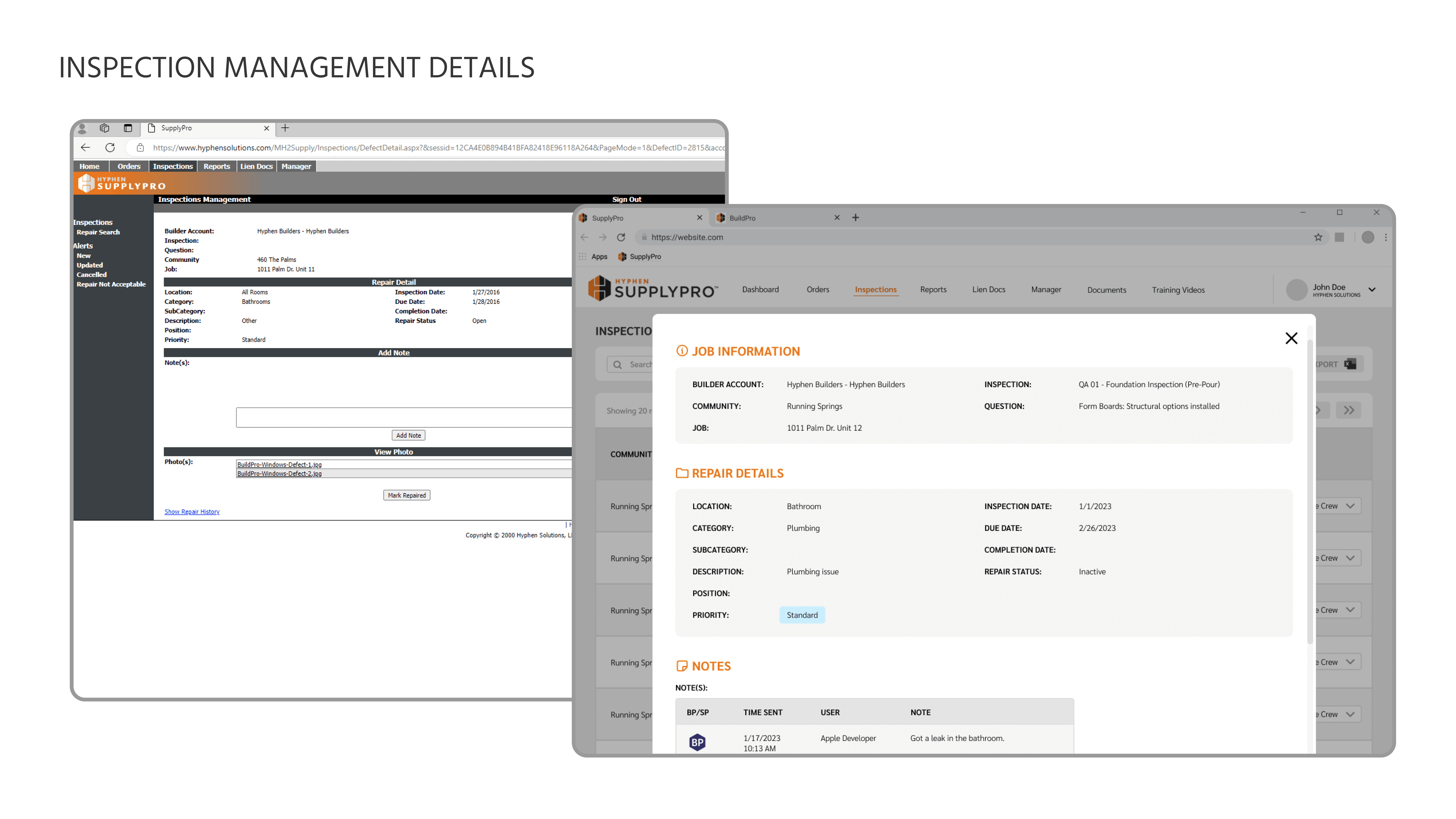
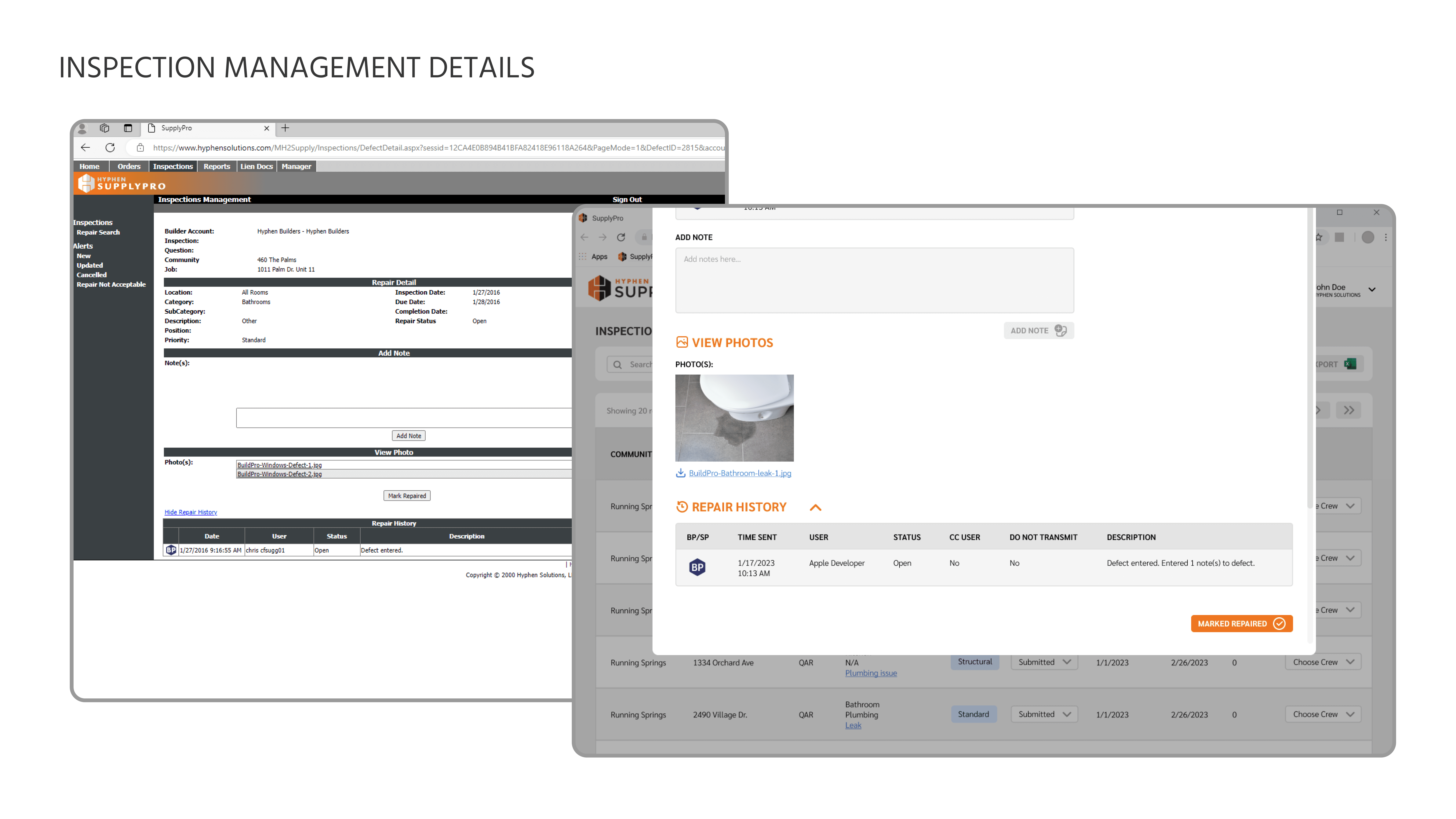
Use images, icons, and color. While designing, I realized that the use of images and icons reduced clutter. Whenever possible and appropriate, I tried to incorporate the use of icons to make identifying categories easier. Additionally, the use of grey boxes improved the grouping and appearance of my designs.
FINAL DESIGN
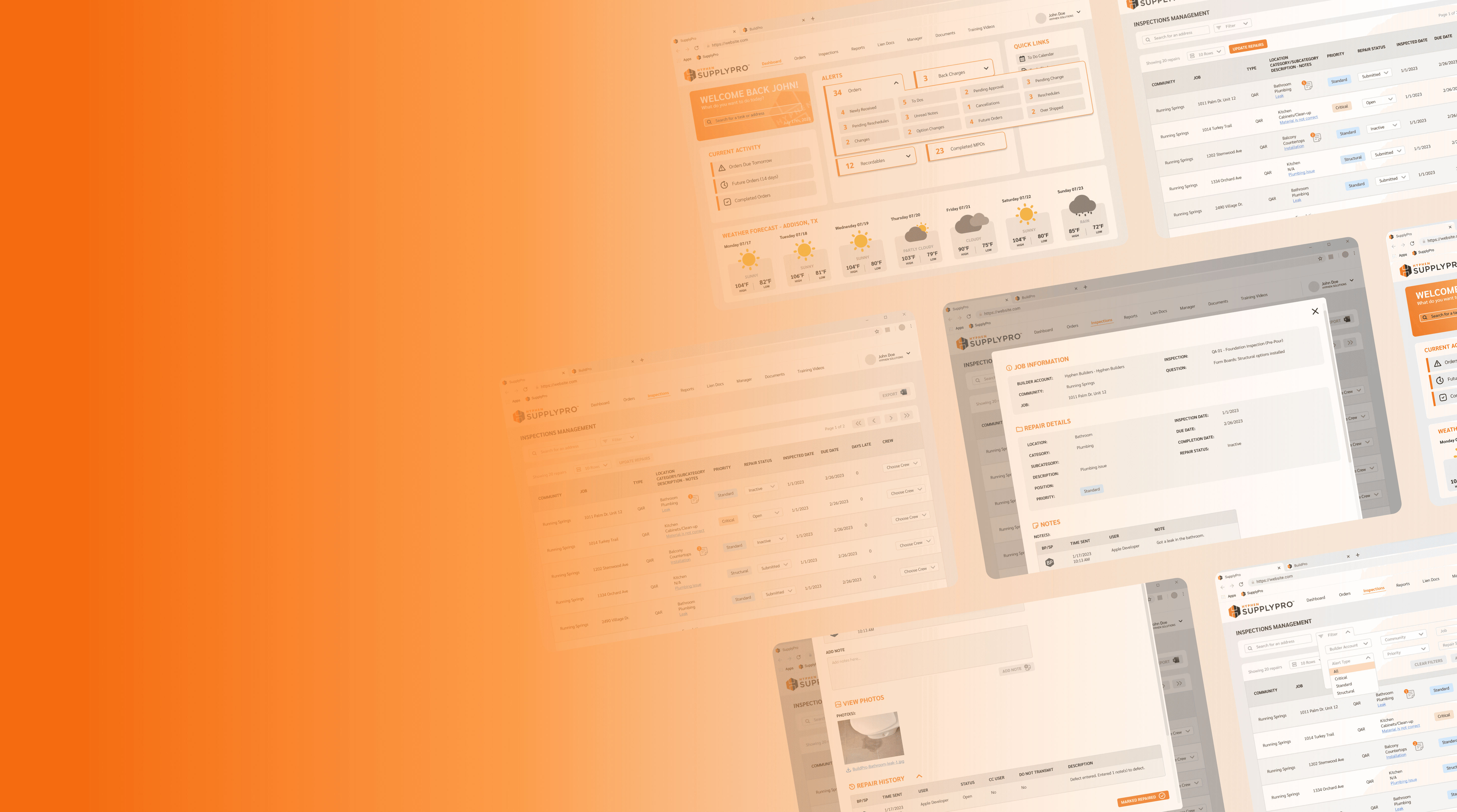
Redesigned SupplyPro
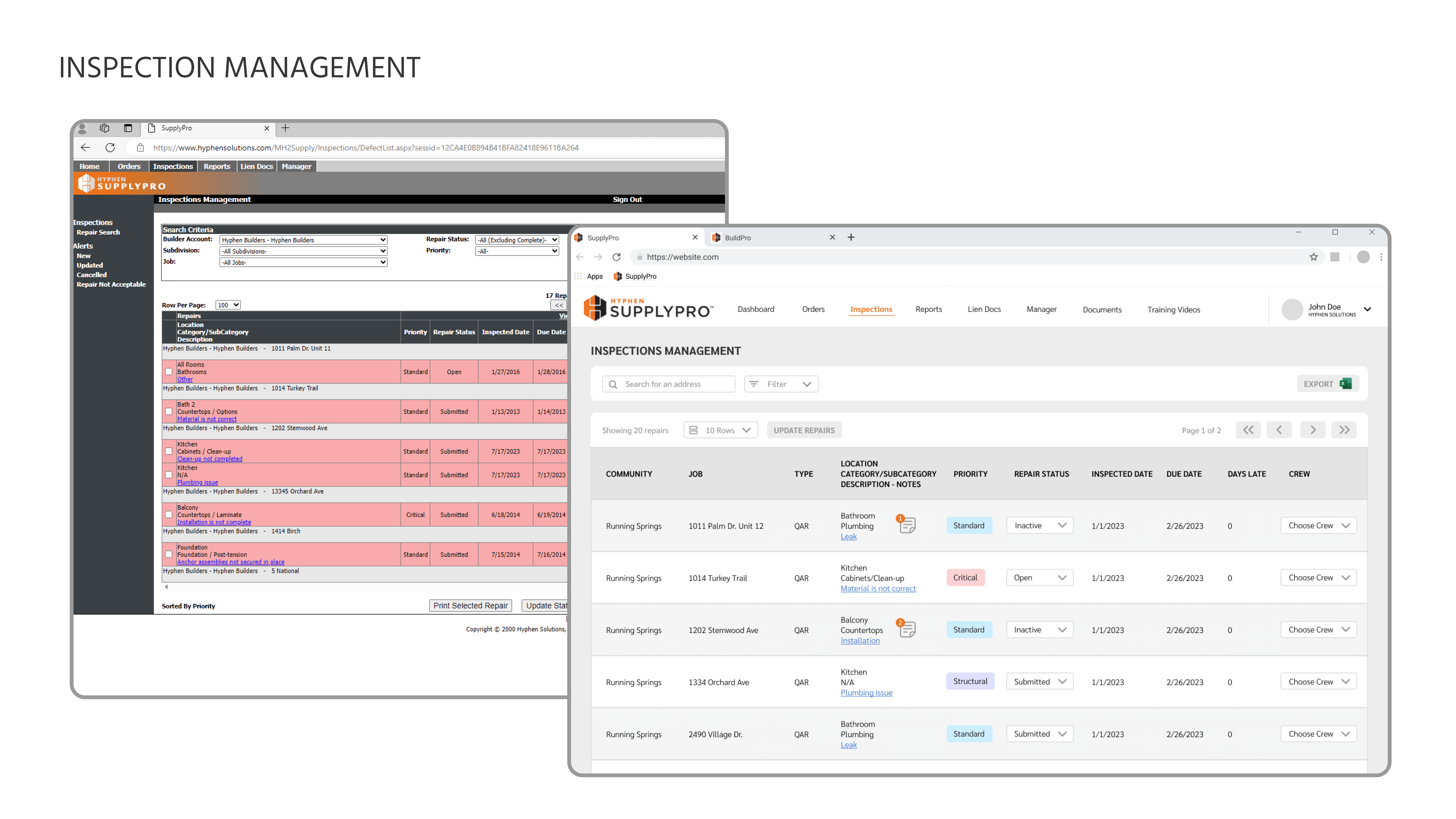
I redesigned SupplyPro to reflect Hyphen Solutions' brand identity while giving it a modern makeover. From reorganized content, a new design system, and intuitive features, the redesigned SupplyPro has a more pleasant user experience. After showing my designs to our of our builder clients, they loved the new redesign and it is now being implemented! This is my redesigned SupplyPro!
